
17 December 2020
Lies, Damned Lies and Coronavirus
What we have learned.
By David Chilvers
 I have been writing these weekly columns since early July. The Shaw Sheet will not be published for either of the next two weeks, so I thought today I would summarise what we have learned about COVID-19 in the past six months and then return to specific topics (of which there are still plenty available) in the New Year. What we have learned breaks down into a number of interconnected areas.
Who is affected by COVID-19?
There has been considerable analysis of the impact the virus has on different segments of the population. In terms of deaths, it is clear that the elderly and those with prior health conditions are much more likely to be seriously affected than others; in addition, gender, ethnicity, urban/rural, housing density, deprivation and occupation also have effects. This was shown by work undertaken by the ONS and by us (see Factors affecting mortality – 3 September).
In terms of becoming infected or transmission of the disease, it was felt originally that children and younger people were less likely to be affected or to be spreaders of the disease. However, since the start of the second wave in September, the number of positive cases among children and young adults has risen more than among other age groups, almost certainly driven by the return to school and university (see the The University Effect – 15 October and How different sectors have fared – 10 December.
Politically, the government was determined that face to face education should resume (although many university students might want to debate how much “face to face” contact exists), and there clearly has been a consequence in terms of positive cases among 10-19 year olds and 20-29 year olds (and more recently to younger children) and the extent to which educational establishments have been the source of outbreaks.
Of course, schools and universities were closed in the first national lockdown and so this may be a reason that the number of positive cases in the first wave was low among children and younger adults.
So, it would seem we have learned that in terms of positive cases and transmission, all age groups are affected but the virus generates more serious consequences among older people and those with existing health conditions.
The nature of the second wave
The second wave appears to be having a different impact to the first wave. If we take the end of July as the end of the first wave, the relevant numbers are as follows (dates in parentheses where relevant):
| Category | Wave 1 | Wave 2 | Wave 2% of Wave 1 |
| Admissions total | 132,332 | 104,101 | 79% |
| Admissions max/day | 3,565 (1/4) | 1,773 (18/11) | 50% |
| In hospital max/day | 21,683 (12/4) | 17,264 (23/11) | 80% |
| Ventilator beds max/day | 3,301 (12/4) | 1,489 (24/11) | 45% |
| Deaths total | 41,269 | 22,656 | 55% |
| Deaths max/day | 1,072 (8/4) | 474 (22/11) | 44% |
| Excess deaths | 55,055 | 11,137 | 20% |
Note: I have not included data on the number of positive tests, as these were severely understated during Wave 1.
Wave 2 is not yet over, but data for Wave 1 was not collected from the start of the wave and so the comparison is reasonably like for like. For admissions and the numbers in hospital, Wave 2 is running at 80% of Wave 1. For the other measures, Wave 2 is running at 50% or less of Wave 1, with excess deaths at present at just 20% of Wave 1 (we will investigate excess deaths more in the New Year as the pattern here is so different in the second wave).
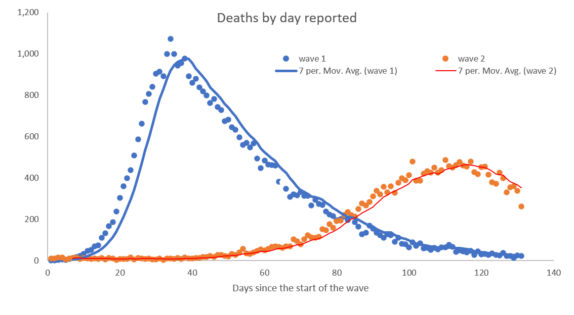
What this data suggests is that the peak of the wave is broader in Wave 2 than in Wave 1 (Wave 1 saw a rapid spike and a quick but long tail, whereas Wave 2 seems to have been a slower but longer build towards the peak).
The chart below illustrates this pattern for daily deaths, shown from the start of each wave.
So, we have learned that the second wave has not had such a large impact as the first wave in terms of any of the measures, particularly for ICU admissions (ventilator beds above) and deaths. Some of this is almost certainly due to better treatments (drugs, different types of ventilation etc) but some appears to be due to a different pattern in the second wave.
The effectiveness of restrictions
Several of these articles have discussed the impact of lockdowns and the Tiering system, as well as the restrictions aimed at people rather than businesses (Do Lockdowns Work? – 26 November). It seems unlikely that the second national lockdown worked, as regions that saw declines in infections (North West, North East, Yorkshire) were declining well before the lockdown started. Other regions, principally London, the South East and East of England saw infections increase during the lockdown period.
Similar conclusions were drawn from analysing the data by the various Tiers, with most of the areas in Tier 3 starting declines before or at the start of the Tier being imposed.
Rather, the conclusion drawn was that the restrictions aimed at individuals rather than businesses were effective, with the Rule of Six probably adding to the impact of social distancing and mask wearing in halting the growth of positive cases and then starting to drive this down. In addition, consumer concern about the pandemic over time appears to be correlated with infection rates, suggesting that when people become concerned, infection rates start to fall – the logic being that concern translates to individual behaviour which then translates to lower levels of transmission. If this hypothesis is true, it has big implications for messaging as it may well be that consistent and honest messages about infection rates may well be as powerful, if not more so, than restrictions which shut down large parts of the economy.
The other concern about restrictions is that they are announced several days in advance (for clear, practical reasons) but during that time people make the most of their current freedoms. Similarly, when restrictions end, there is a tendency to think that everything is fine and people perhaps relax too much. The stop-start nature of restrictions, of itself, may lead to increased infections which a more consistent approach might avoid.
The lesson I would learn from this is that encouraging individual responsibility and adherence to the social distancing rules is probably the best route towards suppression and control of the virus. This avoids the stop-start nature of restrictions, which damages the economy and ultimately leads to other health issues.
The role of scientists
The scientists have performed brilliantly in developing and bringing vaccines into use in such a short space of time. Innovative processes, such as running development and approval in parallel, rather than sequentially, have contributed to this accelerated timetable.
Where I believe the scientists have been less successful has been in their interpretation of the data and in some of their recommendations to government. You could argue that the politicians are the ones that have to walk the fine line between saving lives and saving livelihoods but I believe some of the advice they have been given has led to dubious strategy.
The infamous chart shown by Sir Patrick Vallance illustrating that doubling cases every seven days would lead to 50,000 cases by mid October was wide of the mark and used an “illustration” to be interpreted as a forecast. The equally infamous chart showing four different forecasts of deaths in Wave 2 going up to 4,000 a day was equally wide of the mark and unforgivably based upon out of date information (see A time for reflection – 5 November).
Science is rarely a binary choice and SAGE does not appear to have encouraged any contribution from scientists with a different outlook. Respected scientists including Carl Henaghan and Mike Yeadon come to very different conclusions from analysing the same data and it would seem there should at least be open discussion of what the data is showing rather than sticking to a single interpretation.
My lesson learned from this would be that there should be open debate about what the data is showing encompassing a wide range of outlooks to help guide the politicians to better strategies. For example, without the dodgy 4,000 a day death chart, the second lockdown might have been avoided.
We will continue to learn lessons as time goes by and in some cases not learn lessons but it will continue to be important to critically assess the data that emerges to help us move forward using the tests of credibility, context, curiosity (A time for reflection – 5 November).
This article is one of a series, find last week’s article “How different sectors have fared” here.