
5 November 2020
Lies, Damned Lies and Coronavirus
A time for reflection
by David Chilvers
 There are still many stories to uncover and tell about COVID-19 in the UK*. But this week, as we enter the second lockdown in England, I felt it would be useful to reflect on how the data on the disease has developed and improved since the start of the year and how much work still remains to be done to maximise our use of this resource.
When the first wave of the pandemic took off in the UK in March, there was very little data available to monitor the progress of the disease and help the scientists, medics and politicians make sense of what was happening and thus determine a strategy to fight the disease.
The initial data on deaths only covered those dying in hospitals following a positive test for COVID-19. As the disease spread to care homes, these and other settings were included in the data. But the data was still only based on those who had died following a positive test, so in May analysis of death certificates where COVID-19 was mentioned was introduced. Finally, it was realised fairly early on, not least by Professor Chris Whitty, that there would be indirect deaths due to the pandemic; some of these would be due to delays in diagnosis or treatment of other diseases, some would be due to the impact of the impending recession, including both physical and mental illness. So, the concept of excess deaths, over and above the long-term average was developed, to include deaths both directly and indirectly from the virus.
With testing and the identification of those testing positive to COVID-19, this was initially only undertaken in hospitals. As most of the patients being tested had been brought in with (severe) symptoms of COVID-19, it is not surprising that a high proportion of tests were positive, peaking at just over 40% on 1st April. On that day, 94% of the tests undertaken were Pillar 1 tests, which are defined as “Virus testing in Public Health England (PHE) labs and NHS hospitals for those with a clinical need, and health and care workers”.
During April, Pillar 2 testing was developed with some rapidity, in an attempt to reach Matt Hancock’s target of 100k tests per day by the end of the month. Pillar 2 testing provides virus testing for the wider population, as set out in government guidance and mainly involves those with symptoms being tested at a local or mobile testing site. In spite of the focus on those with symptoms, in the week ending 22nd October 91% of those tested under Pillar 2 resulted in a negative result; this shows how difficult it is to identify COVID-19 as the vast majority of people with symptoms do not have the disease.
At the other end of this spectrum is the number of people who experience COVID-19 but do not exhibit symptoms – the asymptotic group. To measure this and establish the true prevalence of the disease, ONS set up a weekly survey and the Department of Health and Imperial College set up the monthly REACT1 survey. Both of these surveys use a random sample of individuals selected to cover the right mix of gender, age, ethnicity, levels of deprivation, urban/rural and region. The selected individuals are asked to undertake a swab test and the responses are weighted by a wide range of demographic variables to ensure the resulting data properly reflects the characteristics of the population.
These two surveys measure overall prevalence of COVID-19, as compared to the counts from Pillar 1 and Pillar 2 positive tests which, are by their nature, restricted to specific subsets of the population.
All the data produced by PHE and the devolved health administrations is now combined into a single website on which the data is updated on a daily basis (https://coronavirus-staging.data.gov.uk/), contrasting with the situation several months ago where data was spread across a range of websites and required considerable effort to pull together.
So, we are now in a position where there is an abundance of data available about COVID-19 and we have a much better understanding of the strengths and weaknesses of each element of the data. The statisticians have risen to the challenge of generating this data and whilst there are still weaknesses in some parts of it, the situation is vastly improved compared to just a few months ago.
Where effort now needs to focus is on analysing and interpreting this large body of data. In doing so, we need better critique of the analysis and interpretation of data before it is published. We should bear in mind the three principles of data critique according to Tim Harford:
1. CREDIBILITY – intuitively does that number feel right
2. CONTEXT – what is a sensible comparator or counterfactual for this number
3. CURIOSITY – question, check, understand why, repeat
Regarding CREDIBILITY, there is a need to identify areas where this is lacking. Readers will doubtless be familiar with the charts used at the Coronavirus press briefing last Saturday, which were used to underpin the case for the second national lockdown in the UK.
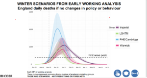
My first reaction on seeing this chart was to wonder how four leading modelling groups, all using the same source data, could come to such wildly different forecasts. The PHE/Cambridge forecast really stands out and in the three weeks since this forecast was produced, PHE/Cambridge has updated its forecast each week, as shown below:
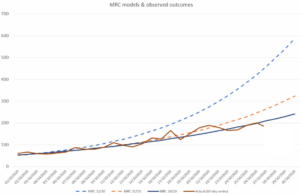
As can be seen, the MRC (PHE/Cambridge) model has revised its forecasts downwards every week since the version that appeared in the Downing Street press release. Like most good scientists, their view changes as more evidence emerges. However, the forecast of the 28th October was not used in the press briefing, preferring to use the original 12th October forecast.
Had the updated forecasts been used, the PHE/Cambridge model would have been more in line with those from the other models and would have probably increased acceptance of the conclusions that were drawn; but using an older forecast, that had clearly been overtaken by events, severely reduces the credibility of that conclusion.
Looking now at CONTEXT, we mentioned last week the need to set data against relevant comparators or counterfactuals, so that sensible interpretation can be made. We provided a media headline which did not include a relevant comparator suggesting that pensioners were much more likely to die of coronavirus than those of working age. This missed the obvious comparator that pensioners are much more likely to die from a wide range of diseases than those of working age and in that respect, deaths relating to coronavirus from older people are pretty much in line with deaths from other causes.
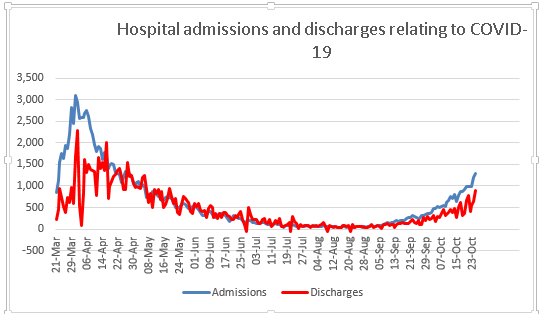
Readers will again doubtless be familiar with the chart of daily admissions to hospital with COVID-19. What you probably won’t have seen is a similar chart on those leaving hospital having overcome the disease. This data is easily available from looking at the number of patients in hospital with COVID-19 and how this changes from one day to the next and then taking account of new admissions and deaths in hospital.
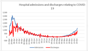
The pattern of hospital discharges follows the same curve as that of admissions, lagged a little. This would be useful context when we draw conclusions about the progress of the disease and would perhaps help balance all the negative news with something more positive and equally valid.
Finally, CURIOSITY, the need to continually ask questions and seek to find solutions which help us understand how things are developing. The chart below shows how the number of positive COVID-19 tests has developed over time since the beginning of August until a week or so ago (I have deliberately left out the last seven days as this tends to be updated); all this data looks at numbers by specimen date.
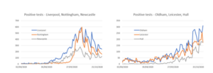
For the three cities on the left – Liverpool, Nottingham and Newcastle – the number of positive tests peaked in mid-October and has since declined, quite sharply in Liverpool and Nottingham. For the three cities on the right – Oldham, Leicester and Hull – the number of positive tests continues to increase. Why is this? I deliberately selected one city in each region where the second wave has had most impact, so it’s not that general regional effect. All the cities on the left have two major universities, which we saw a few weeks ago was a major factor in rising rates in early October; but the same is true for Leicester and Hull; so that is probably not the reason behind the very different patterns in these cities.
I don’t know the answer to the question as to why these cities have different patterns, but my curiosity makes me ask the question; if we knew the answer, we might be able to apply lessons from the areas where rates are declining to those where they are not. What concerns me is that no-one even seems to be asking the question, let alone developing the answer.
As we move forward into the second lockdown, it is increasingly important that we apply these critiques of credibility, context and curiosity to the wide body of data that has now been accumulated; otherwise we will make mistakes in our strategy and policies for coming out of the pandemic.
*Find last Week’s article “The Age Factor” here.