
16 September 2021
Lies, Damned Lies and Coronavirus
Where are we?
by David Chilvers
 In my last article, before the summer break, I summarised the current position with COVID-19:
- The number of positive tests has started to decline both in absolute terms and as a percentage of tests undertaken, the latter being well below the levels reached earlier this year
- Hospital admissions are still trending upwards, but at a quarter of the level seen in February and should be levelling off shortly
- Deaths are creeping upwards but at about 6% of the level seen in February
I asked “Does this mean the pandemic is over?” The conclusion was “Probably not, but I think it does mean the impact that COVID-19 is now having on normal life is considerably reduced and we are seeing this coronavirus to be much more like other such viruses, which we have learned to live with through a combination of a vaccination programme and sensible public health measures. The need for the Government to regulate so much of our lives has probably gone but whether politicians will easily relinquish the control they have been able to exercise over the past eighteen months is still up for debate.”
So, what has happened in the seven weeks since that article was written?
- The school holidays took place and are now over with children in England back in school for over a week and those in Scotland for best part of a month
- People have returned to work in fairly large numbers, with passenger numbers n public transport rising significantly and road traffic back to pre-pandemic levels
- Many mass events have taken place including music festivals, sporting events and the re-opening of nightclubs
The perceived wisdom was that this loosening of restrictions would lead to large rises in infections and the extent to which this translated into hospitalisations and deaths would be dependent upon the continued efficacy of the vaccines.
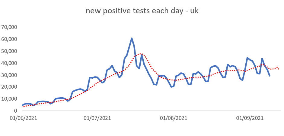
In terms of the number of positive tests, the chart below shows progress since 1st June.
The number of positive tests, as measured by the date of the test, increased until mid-July. Then there was quite a large drop in the second half of July followed by a gradual increase since. But of course, mid July ties in with the start of the school holidays and this meant that all those Lateral Flow Tests in schools (twice per week for most pupils in secondary schools) stopped, as the chart below clearly demonstrates.
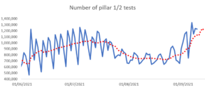
Once schools re-opened in early September, the number of tests undertaken rose steeply and so this will be behind much, if not, all of the increase in the number of positive tests. It is instructive to then look at the percentage of tests which generate a positive result.
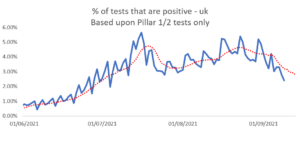
This charts shows clearly that the percentage of tests that generated a positive result increased until mid-July, then dropped, with a small rise in late August followed by a steady fall since the start of September. It is early days yet, but the return to school does not seem to have driven a rise in the percentage of positive cases – so far. Also of interest is that the percentage is well below the 5% level that the World Health Organisation regards as the level where a virus is spreading out of control.
Has this effect translated into hospital admissions?
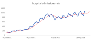
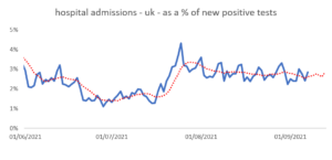
As with the previous metrics, the numbers being admitted to hospital rose from around 200 in early June to just under 1,000 by mid July, again dropped a little in early August and are creeping upwards again. However, recall that at the heights of the second wave in January this year, during a hard lockdown, more than 4,000 patients per days were being admitted to hospital with COVID-19. Indeed, hospital admissions as a percentage of positive tests have trended downwards since early August.
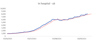
A similar pattern exists with the numbers in hospital with COVID-19. Following steadily but slowly rising admissions, the numbers in hospital with COVID-19 have slowly increased to around 8,000; the peak in January was 40,000.
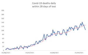
In terms of deaths, a similar pattern appears, with a gradual increase from close to zero in June to around 120 deaths per day in early September. For comparison, the peak daily figure in mid-January was just under 1,400 and to put into context around 1,600 people die each day of all causes in the UK.
To summarise the position now compared with the peak figures reached in January, we can see that in spite of high numbers of positive tests, other metrics show much better results.
| Metric | Currently | Peak | % |
| Positive tests | 35,000 | 70,000 | 50 |
| Hospital admissions | 1,000 | 4,000 | 25 |
| In hospital | 8,000 | 40,000 | 20 |
| Deaths | 120 | 1400 | 9 |
At each stage of activity, the percentage affected declines. We have 50% of the number of positive tests compared to the January peak, 25% of the hospital admissions, 20% of the numbers in hospital and just 9% of the deaths. This suggests that the vaccination programme has halved the number of hospital admissions and reduced the number of deaths by in excess of 80%.
In spite of much doom-mongering prior to the relaxation of restrictions, it does appear that the vaccination programme has performed well in allowing society to move towards its pre-pandemic levels of activity without, so far, leading to a surge in serious illness and death. Of course, each death from COVID-19 is a tragedy, but so is each non-COVID death hastened by a lack of treatment, each job lost and business destroyed by lockdown and each child whose education has been curtailed.
This article is one of a series, the previous article looking at summer holidays is here.