

11 March 2021
Lies, Damned Lies and Coronavirus
Vaccine impact
by David Chilvers
 This week, we look at initial data on the impact of the vaccine rollout. The COVID-19 Actuaries Response Group produced a paper on how the vaccine might impact on the first four priority groups – those aged 70+ – with what seemed to be very encouraging forecasts. So, what has happened in practice since the vaccine roll out started in earnest at the start of this year and have these estimates been vindicated?
These were the forecasts the actuaries produced:
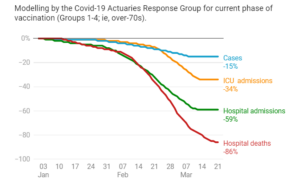
As can be seen, the forecast impact is greatest on deaths and hospital admissions and less on cases and admissions to ICU. So where are we after three months of the vaccination programme and virtually all those aged 70+ having received at least one dose and over one million now having received two doses?
In our article, the UK Vaccine Rollout, we produced a table showing the forecast numbers in each priority group. We have updated this table with two additional columns:
| The vaccine priority list | Individuals | Cum | Take up | Vaccinated | Cum | Date | Average |
| (m) | (m) | Rate (%) | (m) | (m) | Achieved | Date | |
| 1. Residents in a care home for older adults… | 0.4 | 0.4 | 99 | 0.4 | 0.4 | ||
| …and their carers | 0.7 | 1.1 | 90 | 0.6 | 1 | 01-Jan | |
| 2. Aged 80+… | 3 | 4.1 | 95 | 2.8 | 3.8 | 15-Jan | 08-Jan |
| … and frontline health and care staff | 2 | 6.1 | 90 | 1.8 | 5.6 | 21-Jan | 18-Jan |
| 3. Aged 75+ | 2.3 | 8.4 | 90 | 2.1 | 7.7 | 27-Jan | 24-Jan |
| 4. Aged 70+… | 3.3 | 11.7 | 90 | 3 | 10.7 | 03-Feb | 30-Jan |
| … and clinically extremely vulnerable individuals | 2.2 | 13.9 | 95 | 2.1 | 12.8 | 08-Feb | 05-Feb |
| 5. Aged 65+ | 2.9 | 16.8 | 90 | 2.6 | 15.4 | 14-Feb | 11-Feb |
The column headed “Date Achieved” is the date by which the cumulative number of first doses administered exceeds the total required for that group – in effect, the date by which all individuals up to and including that group should have been vaccinated. In practice, there will be some overlap, with some in the 75-79 age group having been vaccinated before all those in the 80+ age group; but these numbers will be small and will not unduly affect this analysis. The column headed “Average Date” is the date by which half of the relevant group will have been vaccinated and I have used this date to assess vaccine impact as I think it has more relevance than the date by when everyone in a group has received their first jab.
We can then use these dates, together with the estimated time delay between each step of the potential journey, from vaccination to infection to hospitalisation to ICU admission and ultimately in a relatively small proportion of cases to death. The lags were estimated in a previous article and are shown in the table below:
| Vaccination by | Infection | Hospitalisation | ICU admission | Death | |
| Days to next step | 0 | 21 | 5 | 4 | 4 |
| Aged 80+ | 08-Jan | 29-Jan | 03-Feb | 07-Feb | 11-Feb |
| Aged 75-79 | 24-Jan | 14-Feb | 19-Feb | 23-Feb | 27-Feb |
| Aged 70-74 | 30-Jan | 20-Feb | 25-Feb | 01-Mar | 07-Mar |
| Aged 65-69 | 11-Feb | 04-Mar | 09-Mar | 13-Mar | 17-Mar |
The logic of this table is that someone aged 80+ should, on average, have received their vaccine by 8th Jan, should have been resistant to infection by 29th Jan, avoided hospitalisation by 3rd February and so on. By looking at what has happened to these age groups along the potential journey, we should see reductions by the dates shown above which should then continue going forward in time.
For the dates coloured mauve, it is too soon to see if there is any effect of the vaccination programme for that age group and that stage of the disease.
It is not simple to see the impact of the vaccination programme as there has been a steep decline in all metrics due to the substantially reduced levels of social interaction driven by the latest lockdown. So, to try and assess the impact of the vaccine programme, I have looked at the percentage of each age group for that stage of the disease:
First look at the data on positive tests, where we might expect to see an initial impact on those aged 80+ from 29th January onwards, for those aged 75-79 from 14th February and for those aged 70-74 from 20th February onwards. The chart below shows the percentage of all positive tests falling in the three age groups – 80+, 75-79 and 70-74. I have marked on each line the date at which we might expect to see the percentage of positive cases reducing for the relevant age group.
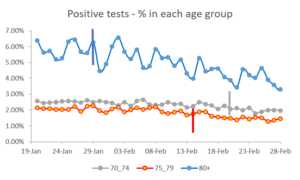
Following the blue line – those aged 80+ – we can see that the percentage of all positive tests does indeed start to decline quite sharply from a few days after the estimated impact date of 29th January. For those aged 75-79 there is a smaller but noticeable decline after mid-February and for those aged 70-74 the decline starts around the estimated date of 20th February. The biggest impact is among those aged 80+, who have had at least one dose for longer than the other two age groups, but even with the other two age groups there is evidence that the percentages are falling.
Turning now to those admitted to hospital, the analysis here has to be undertaken on wider age groups to correspond to the data that PHE publishes each week. The chart below shows the % of hospital admissions in the top three age groups. The vertical bars again mark the dates by which a drop in hospitalisations for the relevant group is estimated to occur.
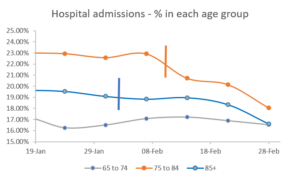
For those aged 85+, there is a gentle fall in the % of hospital admissions in this age group in early February, increasing in slope from mid-February onwards. For those aged 75-84, there is steep fall in the % of hospital admissions in this age group from the date estimated when this effect is predicted to take place. In contrast, the % of admissions of those aged 65-74 is very flat and the estimated date for an impact here is 3rd March, for which we currently have no data.
For ICU admissions, the relevant dates are 7th February for those aged 85+, 15th February for those aged 75-84 and 7th March for those aged 65-74. I have therefore not included the data for those aged 65-74, as we would not expect any effect on this age group as yet.
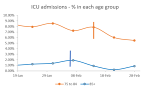
For those aged 75-84, there is a decline which starts in mid-February, as expected. For those aged 85+, a decline starts around 8th February, as expected, but there is a pick up in the latest week. However, the number of those aged 85+ that are admitted to ICU is very small as can be seen, so this is probably just a little blip in the data.
Finally, looking at the data for mortality, the chart below shows this, again for just the older age group, as we would not expect the vaccination plan to impact on those aged 70+ until around now. Even for those aged 75-79, we only expect the vaccination programme to impact upon mortality from 27th February, so I’ve not included this group.
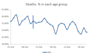
For those aged 80+, there is a downward trend in the % following the estimated impact date of 11th February
So, for all stages in the COVID-19 journey, from infection to hospitalisation to ICU admission to mortality, this data confirms that there are downward trends in the age groups that have been vaccinated, commencing almost exactly when predicted from the rollout of the vaccines. For each stage, the table below looks at the reduction in the % for the top group – either aged 80+ or 85+ – and calculates the reduction per day between the estimated impact date and the most recent data. The data lines up with the actuaries’ model, with deaths having the largest drop in the % and hospital admissions being second.
| age group | current % | initial % | Reduction/day | Rank | Actuaries rank | |
| Positive tests | 80+ | 4.25% | 6.26% | 0.06% | 3 | 4 |
| Hospital admissions | 85+ | 16.62% | 19.09% | 0.12% | 2 | 2 |
| ICU admissions | 85+ | 0.86% | 1.88% | 0.05% | 4 | 3 |
| Deaths | 80+ | 48.59% | 56.69% | 0.43% | 1 | 1 |
This all seems extremely positive in terms of the apparent impact of the vaccination programme in the real world, as opposed to the predicted effect from the trials. Given this success, there is some pressure on the Government to speed up the relaxations of restrictions. This is being resisted on the grounds that, as we can see here, several weeks are required to measure the impact of activity on the progress of the diseases. To put the success of the vaccines in context, we are still coming down from very high levels of infection and it is worth comparing the current position with the low points reach last summer.
| Current level | Low point summer 2020 | |
| Positive tests | 5,753 | 367 |
| Hospital admissions | 699 | 72 |
| ICU admissions | 60 | 8 |
| Deaths | 128 | 3 |
We are still at levels that are between 8 and 40 times where we were in August 2020. Seasonality might make this a slightly unfair comparison, but the data from last year shows how far there is still to go to reach those levels, even with the benefit of a widespread vaccination programme.
This article is one of a series, find last week’s article “variants and variance” here.