

19 May 2022
Lies, Damned Lies and Coronavirus
NHS spending
by David Chilvers

As indicated in my last column, we have decided to investigate health statistics more widely than just looking at COVID data. This week, we look at some very broad data on how much money the NHS spends and the trends in this. There is an implicit assumption in the media that the NHS is starved of funds and the solution to all its problems is more money. Gradually, however, a counter view is emerging that money by itself is not the solution for the NHS going forward.
The chart below, from the Kings Fund, shows the size of the NHS budget in England in real terms. This strips out the effect of inflation and allows us to see whether spending is going up or down.
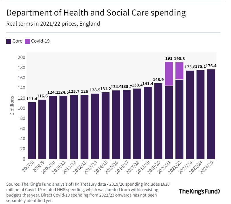
Spending has increased every year in real terms, with very large spikes in 2020-2022 to deal with the pandemic. Government plans post pandemic return NHS spending to real term growth.
However, the population of England has been increasing over the years due to net inward migration and, to deal with an increased population, the NHS needs more funds. The table below shows NHS spending per head from 2007 to 2024 using Government plans for the next two years.
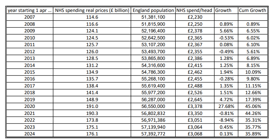
From this table, you can see that for the twelve years from 2007 to 2019, prior to the pandemic, the cumulative increase in NHS spending per head in England was 17%. Using the Government forecasts, this increases to 36% over the period from 2007 to 2024. This is a substantial increase and there are a number of factors that may have contributed to this:
- More NHS staff in England
- Pay rises for staff above the rate of inflation
- More expensive treatments
- Lower staff productivity
There is data for some of these areas so we will examine it and see to what extent each factor is driving the spending increases
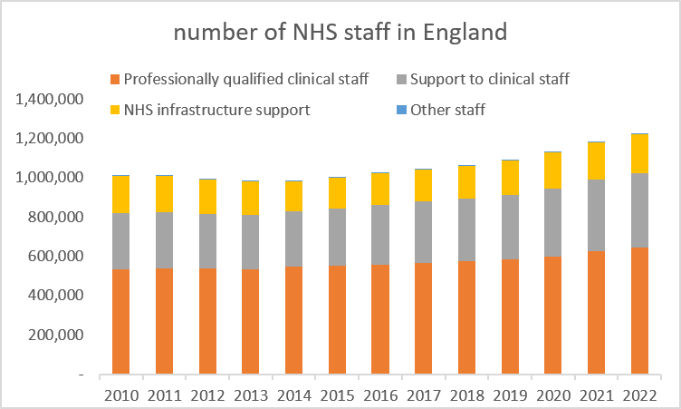
This chart on the number of Full Time Equivalent (FTE) NHS staff in England comes from data on the NHS website showing information for January each year (we have selected January as January 2022 is the latest month for which data is available). FTE data is preferable to headcount as, for example, when a job is shared between two individuals it will just be shown as 1 or possibly a little over 1 if the two sharers have some overlap time.
Following a dip as austerity bit after the 2010 financial crisis, numbers have steadily increased for professional staff and clinical support staff and stayed steady for NHS infrastructure support staff; growth from 2010 to 2019 was 12.27%, 20.40% and -3.70% respectively and this compares with growth of 10% in the NHS real spend per person over the same period.
This data appears to dispel the myth that an increasing proportion of NHS spending goes onto management as all the growth in staff is in professional and clinical support staff and the increase in staff numbers is similar to the increase in the NHS real budget per person in England. The real term increase in the NHS budget appears to have largely gone into increases in clinical staff.
Given this increase, you might have expected outcomes of various sorts to have improved over the past ten years or so. But this appears not to be the case across a wide range of metrics. The main stream media have recently been showing how ambulance waiting times and waiting times at A&E have deteriorated significantly during the pandemic.
Ambulance services have four key response time targets which depend upon the severity of the reported condition:
Category 1 – An immediate response to a life threatening condition, such as cardiac or respiratory arrest – target 15 minutes
Category 2 – A serious condition, such as stroke or chest pain, which may require rapid assessment and/or urgent transport – target 40 minutes
Category 3 – An urgent problem, such as an uncomplicated diabetic issue, which requires treatment and transport to an acute setting – target 2 hours
Category 4 – A non-urgent problem, such as stable clinical cases, which requires transportation to a hospital ward or clinic – target 3 hours
Data for England shows the 90% percentile figure since 2017:
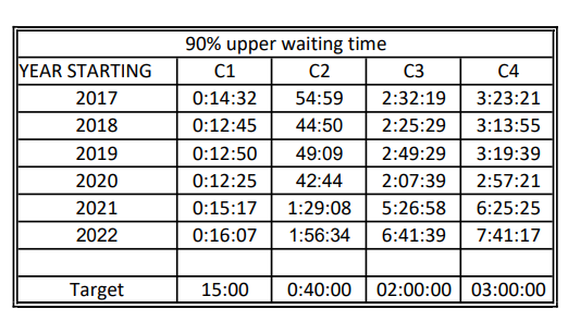
For the most serious of incidents – type C1 – the ambulance service in England has just about met its 90% upper waiting time threshold. But for the other three categories, the waiting time targets have not been met at all during this period and although there was a slight improvement in the first four years, performance has been much worse since the start of the pandemic.
In terms of waiting times at A&E in England, the chart shows:
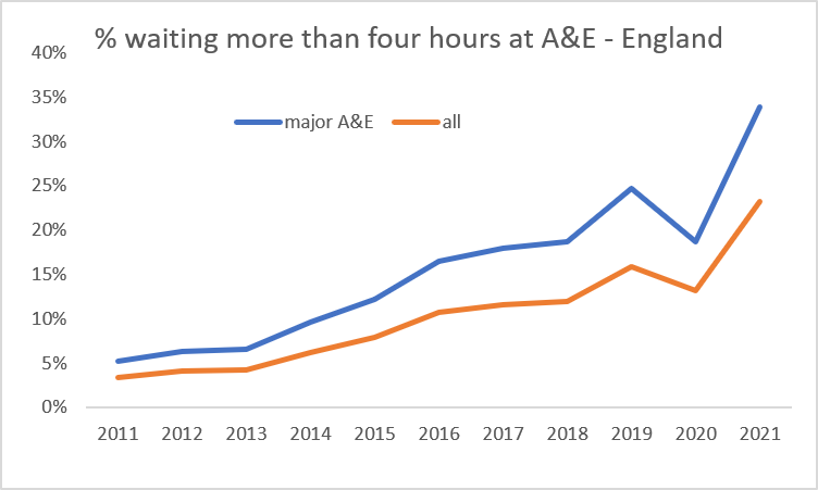
This data is for the year starting 1st April, so the last two years are 2020-2021 and 2021-2022. In that first year, the total number of A&E attendances dropped substantially from 25,017,116 to 17,429,559, as people were afraid to go to hospital for fear of contracting COVID-19. In the year from April 2021, numbers attending A&E increased to 24,374,967, virtually the pre pandemic level.
So, the drop in the percentage of four hours plus waits in 2021-2021 was almost certainly due to the lower number of visits to A&E. But the key point in this chart is that the percentage of four hours plus waits in A&E had been steadily increasing year on year for a long time prior to the pandemic, in spite of the increases in resources identified earlier.
In summary, this initial dive into NHS statistics has shown that:
- NHS real spending per head has increased substantially over the last 10-15 years
- The number of clinical staff employed has increased by a similar amount
- There is no evidence of any increase in general management positions
- The outcomes investigated – ambulance response times and waiting times in A&E – have deteriorated over the same period, particularly waiting times in A&E, which were on an upward trend before the pandemic
This appears to suggest that increased funding on its own will not solve NHS problems, as previous increased funding has been accompanied by no improvement in the two areas investigated. In future articles, we will look at other outcomes and see whether similar conclusions can be drawn.
This article is one of a series, the previous article on “Spreading the Net” is here.