
19 November 2020
Lies, Damned Lies and Coronavirus
Case positivity
by David Chilvers
In our article on 1st October, we looked at the issue of how many positive cases exist at any point in time and how these vary according to the metric being analysed. Today, we return to this theme but look at the data from a slightly different angle – the percentage of tests undertaken that are positive.
There are three sources of information on this positivity metric (the % of tests undertaken that yield a positive result):
- Pillar 1 tests undertaken in hospitals and hospital labs
- Pillar 2 tests undertaken among the wider community
- Tests undertaken as part of one of the random surveys to measure prevalence
Pillar 1: NHS and PHE Testing is virus testing in Public Health England (PHE) labs and NHS hospitals for those with a clinical need, and health and care workers. As mentioned last week, in the early days of the pandemic, this was the only type of testing undertaken and mostly covered patients coming into hospital with fairly severe COVID symptoms. As a result, the positivity rate was very high – above 40% in early April. Since then, positivity measured from this type of test has dropped and then increased again as the second wave developed,
Pillar 1 continues to include patients coming into hospital with COVID symptoms but it also includes all patients planning to have surgery, who are checked for a negative test before they are allowed to have their procedure. We would expect the positivity of this latter group to be near the natural level in the population and the former group to be quite high. So overall we would expect the positivity rate for Pillar 1 tests to be a bit above the natural level in the population.
Pillar 2 uses Lighthouse laboratories and has partnership arrangements with public, private and academic sector laboratories to cover the wider population and until recently only included those showing COVID symptoms. We would expect the positivity rate for this group to be much higher than the natural level in the population. In the last week or so, Pillar 2 tests have been expanded to all residents in the Liverpool City Council area, as part of Operation Moonshot, aimed at extending testing to the wider population including those without COVID symptoms. The latest data suggests that over 100,000 people without COVID systems have been tested in Liverpool with around 700 generating a positive result – a positivity of 0.7%.
The weekly ONS survey and the monthly REACT survey measure the natural level of prevalence in the population. At present, the ONS survey is at 1.34%, so a little higher than the Liverpool mass testing value.
All three of these measures exist over time and can be analysed at a regional level. The figures for England show the pattern we might expect with Pillar 2 prevalence highest and Pillar 1 between this and the natural prevalence level as measured by the ONS survey.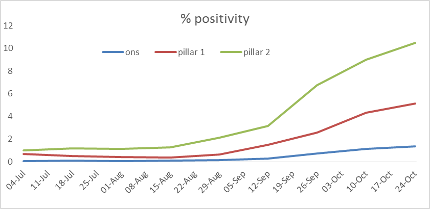
This chart shows the prevalence level for each of the three metrics and the lines all follow the same shape. Indeed, the correlation between the three series is very high (between the ONS measure and Pillar 1 the correlation is 0.995 and between the ONS measure and Pillar 2 the correlation is 0.996). What this means is that for all the imperfections in the way Pillar 1 and Pillar 2 statistics are gathered and the effect that changing testing strategies might have, the Pillar 1 and Pillar 2 positivity estimates are excellent predictors of the ONS positivity rate.
The table below shows how well Pillar 1 and Pillar 2 positivity rates estimate the ONS figure.
| two weeks starting | ONS | using pillar 1 | using pillar 2 | Average from using Pillar 1/2 |
| 04-Jul | 0.06 | 0.13 | 0.03 | 0.08 |
| 18-Jul | 0.10 | 0.08 | 0.05 | 0.07 |
| 01-Aug | 0.06 | 0.06 | 0.05 | 0.05 |
| 15-Aug | 0.08 | 0.04 | 0.06 | 0.05 |
| 29-Aug | 0.14 | 0.11 | 0.18 | 0.14 |
| 12-Sep | 0.27 | 0.35 | 0.32 | 0.33 |
| 26-Sep | 0.72 | 0.66 | 0.81 | 0.73 |
| 10-Oct | 1.14 | 1.13 | 1.11 | 1.12 |
| 24-Oct | 1.34 | 1.36 | 1.31 | 1.33 |
If you took the average of the estimates using Pillar 1 and Pillar 2, this would be fairly close to the ONS figure.
You may be thinking, isn’t this all a bit academic, just showing that Pillar 1 and Pillar 2 metrics can estimate the ONS data? But there is a value, in that it takes about a week for the ONS figures to be produced, whereas the Pillar 1 and Pillar 2 data is available a couple of days after the counts are made. You will often hear commentators saying that we need to wait for the results of the ONS or the REACT survey to be updated to assess the progress of the pandemic but this analysis suggests that the Pillar 1 and Pillar 2 positivity data are very good predictors as to what the subsequent ONS data might show.
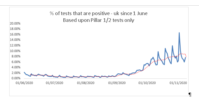
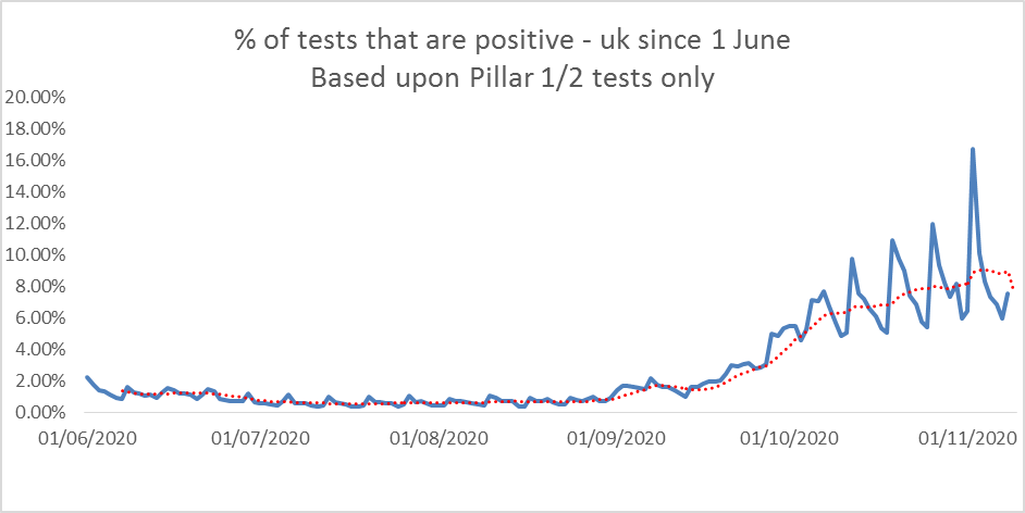 This chart shows the Pillar 1 and 2 combined positivity rate in the UK since the start of June and includes much more recent data than that covered by the ONS survey (up to 13 November for the Pillar 1 and 2 tests compared to up to 6 November for the ONS data). The Pillar 1 and 2 data shows a levelling off and the start of a decline in the % of tests that generate a positive result, suggesting that the peak of infection in the second wave may be close or even past. This is of great significance to planning strategy over the next few weeks, including forecasting hospital capacity and indeed the extent to which lockdowns might be eased or continued; if we waited for the ONS data to (very probably) come up with the same conclusion, significant time may have been wasted.
If we use the Pillar 1 and Pillar 2 positivity rate from last week’s PHE Flu and COVID Surveillance report, this estimates the ONS rate at 1.20% for week ending 14th November, compared to 1.34% two weeks earlier. It’s always dangerous to make forecasts, but this drop in the estimated ONS rate is consistent with the flattening off and then slight decline in the daily data shown in the above chart. The latest ONS data will be out on Friday, so it won’t take long to see if this forecasting approach is in the right area and can thus provide a useful leading indicator.
* This article is one of a series, find last week’s article “Understanding Models” here.