7 January 2021
Lies, Damned Lies and Coronavirus
The new variant
by David Chilvers
 We are now in 2021 and a Happy New Year to all readers of this column. It will continue to highlight any inadequacies in the COVID-19 data and its analysis.
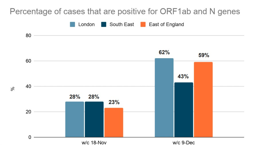
This week we look at the new variant, first brought to the public’s attention in the UK government’s COVID press briefing on 19 December and show that it is only part of the reason for the recent rise in infections. This is the final chart shown by Sir Patrick Vallance on that day:
The data shows a large increase in the percentage of positive COVID-19 tests that contain either the ORF1ab gene and/or the N gene but not the S gene present in most of the early positive COVID-19 tests. It supports a hypothesis that the rising number of positive COVID-19 tests in these three regions was being driven by a rapid increase in the number of cases where the “new variant” was present.
This data is provided as part of the weekly ONS Infection Survey and the percentage of tests containing the relevant genes for England is shown below, together with the number of positive tests in the weeks in question and the consequent number of positive tests that contain one or more of these two genes (but not the S gene):
| England | Percentage of positive tests- by gene | Total | OR or N | OR or N | |||
| Week starting | N only | OR only | OR+N | OR or N net | Pos tests | Pos tests | Cum |
| 21-Sep | 13 | 4 | 4 | 21 | 39,995 | 8,399 | 8,399 |
| 28-Sep | 11 | 2 | 10 | 23 | 70,264 | 16,161 | 24,560 |
| 05-Oct | 14 | 5 | 9 | 28 | 91,626 | 25,655 | 50,215 |
| 12-Oct | 12 | 3 | 8 | 23 | 102,033 | 23,468 | 73,683 |
| 19-Oct | 15 | 4 | 7 | 26 | 129,345 | 33,630 | 107,312 |
| 26-Oct | 11 | 4 | 7 | 22 | 130,822 | 28,781 | 136,093 |
| 02-Nov | 8 | 8 | 9 | 25 | 147,165 | 36,791 | 172,884 |
| 09-Nov | 15 | 5 | 13 | 33 | 151,011 | 49,834 | 222,718 |
| 16-Nov | 11 | 6 | 12 | 29 | 113,087 | 32,795 | 255,513 |
| 23-Nov | 15 | 8 | 18 | 41 | 86,740 | 35,563 | 291,077 |
| 30-Nov | 20 | 8 | 24 | 52 | 88,413 | 45,975 | 337,051 |
| 07-Dec | 19 | 8 | 35 | 62 | 124,129 | 76,960 | 414,011 |
| 14-Dec | 10 | 5 | 49 | 64 | 144,395 | 92,413 | 506,424 |
What is interesting from this ONS data is that the percentage of positive tests which only had one or both of these two genes for the two relevant weeks is similar in England as a whole (29% and 62%) as in the three regions shown in the chart. The genes present in positive COVID-19 tests was not significantly different in London, the South East and East of England from those in the rest of the country. This means that it is unlikely that the changing gene structure was responsible on its own for disproportionate growth of positive tests in London, the South East and the East of England.
By the end of week commencing 7th December, applying these percentages to the daily test results, there had been just over 400,000 positive tests where only the OR and/or N gene had been present and the number was growing steadily. So imagine my surprise when I read a PHE press release dated 14th December (PHE investigating a novel variant of COVID-19 – GOV.UK (www.gov.uk)) which stated that “As of 13 December, 1,108 cases with this variant have been identified, predominantly in the South and East of England.” How can a variant which is shown in Sir Patrick Vallance’s chart as being responsible for 400k cases be the same as one which has only led to 1,108 cases over the same time period?
One part of the answer is that not all positive tests are genome sequenced. According to a recent report only 5-10% of positive test results are genome sequenced; this would raise the figure of 1,108 quoted by PHE to 10-20,000, larger but that is still well adrift of the 400k imputed from positive tests where only the OR and/or N gene had been present.
Another potential factor is that the data shown in the chart relates to all occurrences of just the OR and/or N genes in the virus whereas the 1,108 cases quoted by PHE England relate to the specific VUI – 202012/01 or B.1.1.7 variant that was genome sequenced, which is just one of many variants identified with just the OR and/or N genes.
The UK variant has 14 mutations that cause a change in protein building blocks (amino acids) and three deletions (missing bits of genetic code).
According to the World Health Organization (WHO), some may influence how fast the virus spreads.
- One mutation in the spike protein (known as N501Y) has been detected in several variants, including the one from South Africa. Lab experiments suggest this mutation may help the virus bind to human cells, according to the Centers for Disease Control and Prevention (CDC).
- Another mutation in the spike protein (P681H) is thought to be of “biological significance”, according to the WHO
- A deletion (at position 69-70) has been linked in the past to mink farm outbreaks and in patients with weakened immune systems who can incubate the virus for several months
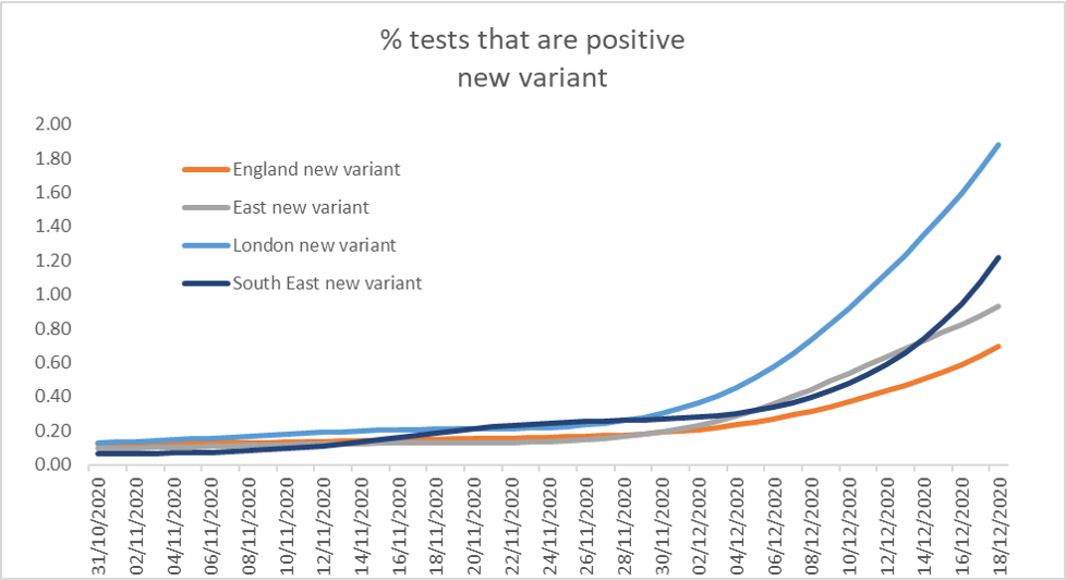
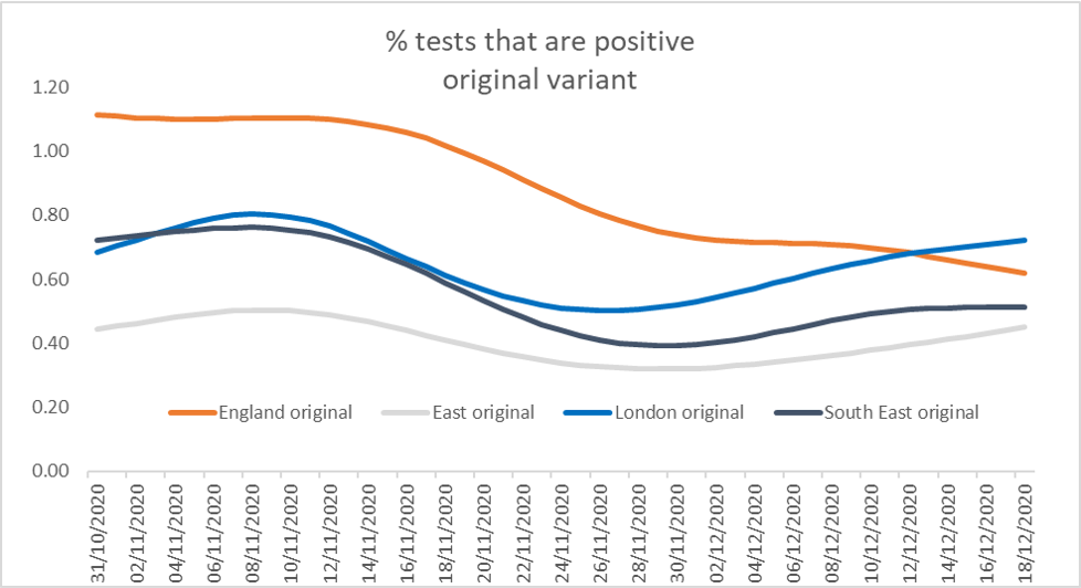
It is evident from this data that the new variant of concern is just one of many mutations of the virus and it does appear to be increasing infection rates substantially, even if it doesn’t account for all of the surge in positive cases seen since the second national lockdown ended. As the two charts below show, there have continued to be increases in the percentage of positive tests that come from the original strain in London, the East and the South East as well as the new variant:
The chart above shows clearly how the percentage of positive tests that come from the strain associated with the new variant have increased sharply in the three regions in December, contributing the increase for England as a whole.
The chart above shows that whilst the percentage of tests that are positive with the original variant is reducing for England as a whole, that is not the case for the three regions most affected by the new variant – positive tests are going up for the original variant as well.
A new variant is therefore part of the reason for rapid growth in the three affected regions, but it is not the only reason as the percentage of tests that give a positive result for the original strain have also increased. Clearly something is going on in these regions that is fuelling infections in addition to the discovery of a new variant. This might be less adherence to social distancing rules or it might be that the East and the South East were less affected up until now by COVID-19 and therefore the potential for spreading infection was thus greater than in the Midlands and the North which were badly hit in the autumn.
Another thing I find odd about the new variant is that it is “50-70% more transmissible”. What does this mean? I think it means that if I have it, I am likely to pass it on to more people than the original variant. But if this is the case, why have the rules on social distancing not changed? Should I now give someone 3 metres berth rather than 2? How long is it recommended to stay close to someone not in your household – is this still 15 minutes or is it less? If the new variant is more transmissible, surely the social distancing rules should change – but apparently not.
This article is one of a series, find the last article “What we have learned” here.

