
11 November 2021
Lies, Damned Lies and Coronavirus
Here we go again
by David Chilvers

From an information perspective, the early part of the COVID-19 pandemic was characterised by poor data and selective use of what was available to hide inconvenient truths. Some of the worst examples of the latter included:
- Omitting data on cases and deaths in care homes, even when these became a major driver of infection in March/April 2020
- Double counting the number of tests undertaken to help reach targets in May/June 2020
- The infamous “Vallance” projections in October 2020, which ignored more recent data to show scary predictions of hospitalisations and deaths
All these examples either suppressed important data or used information selectively to help meet political objectives – meeting targets and trying to change behaviour by scaring people.
Over time, the accuracy, transparency and regular publication of data helped to eliminate these sorts of data misuse and the daily updating of the Government’s coronavirus website provided the key metrics in a way that was easy to access and interrogate. Other sources, such as the Spectators COVID dashboard, took this further by incorporating other data sources both in the UK and elsewhere to provide a comprehensive picture of how the pandemic was developing.
Given this, it was disappointing this week to see Amanda Pritchard, the new head of the NHS in England, misuse statistics so badly in claiming that the number of COVID patients in hospital was 14 times the level of the previous year. This was clearly complete nonsense and yet the mainstream media reported on this story as if it was some inalienable truth before having to hastily backtrack. The excellent Ed Conway of Sky News must have been mortified to see his colleagues publish this story and had to quickly point out the reality of the situation. He said:
“Are there really 14 times more people in hospital with COVID-19 than there were this time last year? The short answer to this question is no.
In fact, over the past fortnight, the number of people in hospitals in England with COVID has been lower than last year. In other words, it’s not so much that she’s got the magnitude of her claim wrong, the entire basis of it is wrong, as of now.
Here at Sky News we do our best to check these facts as quickly as we can. We don’t always get it right, but if we notice something fishy we’ll do our best to correct it or provide context as soon as we can. It’s quite unusual – and I say this as someone who’s been sifting through this stuff since the very beginning – to come across something quite so fishy coming from such a senior figure. But perhaps this tells you as much about the state of mind at the top of the NHS ahead of this winter as it does about their grasp of the numbers.”
The data Pritchard had been referring to related to August 2021 compared to August 2020, which the NHS claimed was “the latest data available”. This conveniently ignores the fact that data on the numbers of COVID patients in hospital as at 5th November is available on the Government coronavirus website, sourced from NHS England and the devolved nations counterparts.
The chart below shows the number of COVID patients in hospital in the UK since the pandemic started in January last year.
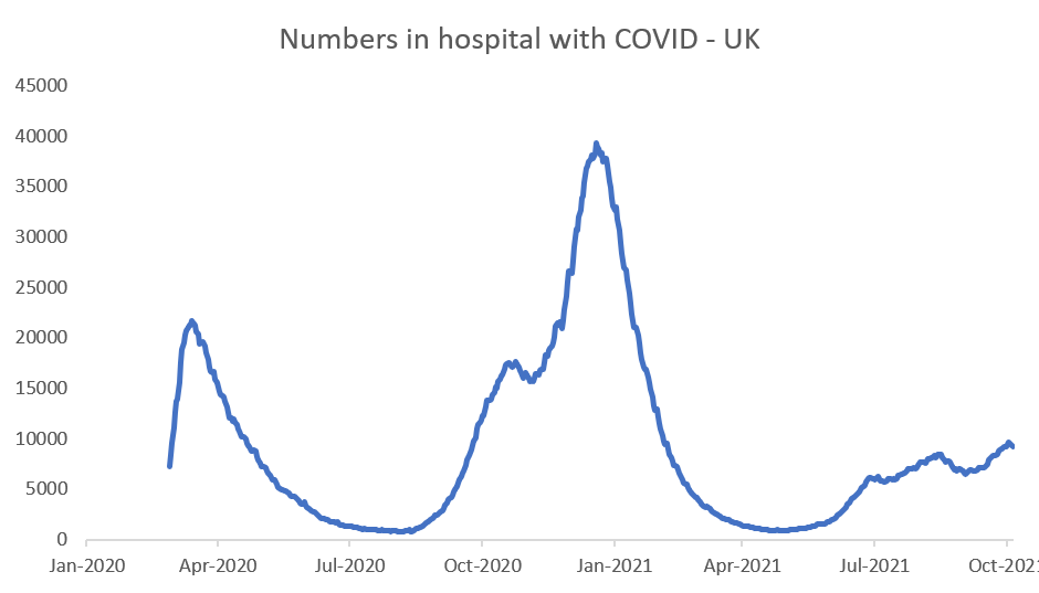
In fact, the number of people in hospital in the UK with COVID-19 has been creeping up as the following table of the average number each month shows:
| Month | 2020 | 2021 | Ratio |
| Jan | 35,100 | ||
| Feb | 21,638 | ||
| Mar | 9,752 | 7,198 | 0.74 |
| Apr | 18,511 | 2,316 | 0.13 |
| May | 10,688 | 1,027 | 0.10 |
| Jun | 4,984 | 1,282 | 0.26 |
| Jul | 2,004 | 4,106 | 2.05 |
| Aug | 992 | 6,410 | 6.46 |
| Sep | 1,320 | 7,688 | 5.82 |
| Oct | 6,729 | 7,704 | 1.14 |
| Nov | 15,873 | 9,339 | |
| Dec | 19,318 |
Here we see that there were considerably more people in hospital in the UK during the summer this year, following the easing of restrictions on July 19th. The ratio of 2021 levels to 2020 levels did indeed reach a maximum of 6.46 in August but has since been declining to just over 1 in October.
So, clearly the claim of 14 times the number of people in hospital with COVID-19 this year compared to last year is not supported by the facts and can only be seen as selective data, chosen to prove a point; in this case, the usual claim that the NHS is becoming overloaded with COVID and a crisis is imminent. Whilst not wishing to belittle the difficult state in which the NHS finds itself, is COVID-19 likely to surge again in the near future?
Many commentators have concluded that the recent fall in the number of “cases” is evidence that we have reached a peak in the current wave. The chart below shows how “cases” have developed during the pandemic (this chart excludes the last three days in the series as these numbers are likely to be revised upwards).
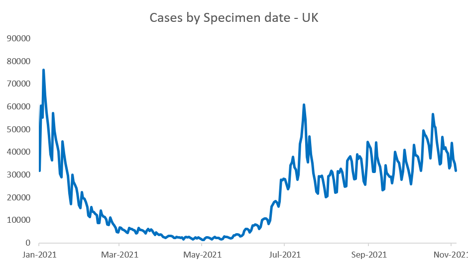
But as we know “cases” are not number of infections, they are the number of positive cases recorded and this depends upon the level of testing activity. When testing is high, you are likely to find more “cases” than when it is low. The penultimate week of the above chart covers the school half term period, when tests are not undertaken in schools and the level of testing is indeed lower and has been declining during October.
The key metric to look at is the % of tests undertaken that are positive.
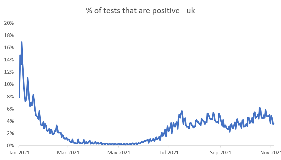
We can see from this chart that, notwithstanding the fall in the number of tests in recent weeks, the percentage of those tests that generate a positive result is also falling. Given that hospitalisations lag “cases” by a week or so, we would expect to see hospital admissions starting to stabilise around now and then start to fall and the numbers in hospital follow a similar pattern. This indeed is what has happened to the numbers in hospital in the UK:
| 27/10/2021 | 9003 |
| 28/10/2021 | 9076 |
| 29/10/2021 | 9166 |
| 30/10/2021 | 9216 |
| 31/10/2021 | 9371 |
| 01/11/2021 | 9608 |
| 02/11/2021 | 9580 |
| 03/11/2021 | 9352 |
| 04/11/2021 | 9191 |
| 05/11/2021 | 8966 |
From a peak of 9,608 on 1st November, the number of COVID-19 patients in hospital is down 600 to 8,966 on 5th November. Early days yet, but there does seem to be some evidence that we are at or just past the peak of the current wave. Much will depend upon the levels of social interaction in the next month or so as colder weather means more contacts will be indoors, but there is some hope. Unlike the 14 times as many patients in hospital, which is clearly nonsense and designed to evoke a particular response from the public and politicians but at the end of the day; just like the infamous Vallance graph it brings the NHS into disrepute.
This article is one of a series, the previous article on vaccinations is here.