19 May 2016
The Eye of the Beholder
by J.R.Thomas
 London is in the grip of a boom at the moment. Not in luxury flats, though there has been. Or in bicycle superhighways, though there is. Nor in high rise buildings, though that cannot be denied. No, the boom we refer to is in learned, and perhaps not quite so learned, lectures. Almost every night in some central location a distinguished and often erudite figure rises to its feet at about 6.30pm and for an hour or so enlightens an audience on some perhaps arcane, perhaps commonplace, subject. Some lectures are free, but usually they have to be paid for, sometimes quite expensively. Even so, they frequently sell-out in advance. Which does not mean they are full of business types, improving their minds on the way home from the office, though there are plenty of those. The audiences are well leavened with all those who live in and around London – students, old ladies from small flats in town, academics, those who toil in the suburbs, even if their toil is home and child care, who escape to hear something new and maybe enjoy a glass of wine afterwards. Such an evening is often cheaper than the theatre, with equally good bragging rights as to the leading character and the sheer joy of been especially well informed about some aspect of life, something to impress friends and neighbours.
One of the best is the series currently running at the China Exchange in Soho. The China Exchange’s mission is to inform the people of the UK about China, from many, diverse and often obscure angles. It is founded, driven, and assisted in many ways by Sir David Tang, former academic and then leading Hong Kong retailer, a billionaire with a contact book that must be one of the best in the world. Tang is on a mission to improve mankind, to educate, explain, enlighten. And in spite of China Exchange’s mission statement to tell the world more about the wonders of China, he interprets that very broadly – recent lecturers have included Naomi Campbell, Joseph Fiennes, Lord Heseltine; and you still have time to catch Cherie Blair, Jeremy Irons, and Sir Michael Caine. But you are too late to catch Sir David in conversation with Alain de Botton, philosopher, novelist, and life guru.
The Shaw Sheet though was there, and enjoyed an especially rewarding and thought provoking evening; the two principals having the sort of wide ranging and unconventional minds that can provide stimulating thoughts and startling insights. In the course of their conversation De Botton talked about London and how life in London is affected by the built environment. “Why” he pondered “is there such a lack of beauty in modern architecture?”

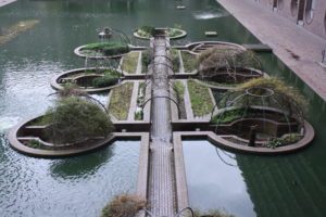
Lords Foster and Rogers were not in the audience but, had they been so, they would doubtless have risen to protest at such traducing of the visions in steel and glass with which they have so jollified the world over the last thirty years. This might be a fair reaction – One London Wall (Foster) for example has a simple elegance and flow to its curving form that is genuinely beautiful, as does his Cambridge Law Faculty Library, and Roger’s Senedd building, home of the Welsh Assembly, has a powerful grace and presence eminently suitable for a home of democracy, and deserves to be far better known. And there are a number of other modern buildings by other architects, which, if frequently the cause of controversy in planning, do lift the spirits of the passer-by once built and occupied. But, sadly, much of what is built is dull at best, banal and compromised by standardisation. Indeed, in both large scale commercial architecture and in domestic architecture there is terrible blandness; too much visible economy, too much glass, and too little pondering of context and placement.
We are not naïve; building things costs a great deal of money, more and more money with modern regulation relating to environmental factors, safety rules, planning gain. Property developers will usually only make things beautiful if that helps let or sell the resulting building. Though of course making something look good does not always involve extra cost. The builders of elegant Georgian terraces were often saving money by their very elegance – the look of a Georgian terrace is not in the decorations or complexity of construction, but in the sense of rhythm and proportion, something which reflects an economical use of land and saved construction costs. The Georgian architect developers had nothing to learn from us about standardisation and building to a pattern. Yet they could subtly vary and shape their standard products to create interest and excitement. Here is a lesson which looks sadly lost on the designers of London’s new underground railway, Crossrail. The recently published designs for the stations show proposals so dull and bland that one wonders how £14.8bn of money could be spent with so little visible to uplift or delight passengers. Creating stations and passenger spaces of excitement and beauty simply by better use of shape and perspective and colour would probably have added nothing to the cost of what is now likely to be provided; it is so dull that the wholesale application of instructions (“DO NOT RUN” “STAND ON THE LEFT” “NO SMOKING”) and endless and massive advertisement posters, will be an improvement.
De Botton, as he often does, seems to be capturing the early stages of a wave. One of Zak Goldsmith’s little reported remarks in the recent London mayoral election was that he wanted a much more thoughtful approach to high buildings in London, and such buildings, if permitted, should be of real elegance, strong enhancements of the cityscape. One of the most popular television programmes is Kevin McCloud’s long running series “Grand Designs” which each week follows the travails of usually underfunded private persons, often with no experience and with a baby on the way, building their dream house. The houses are often beautiful indeed, eccentric, certainly one-offs. Grand Designs has awakened a whole world of amateur builders who want to enhance the world by building something special and, at least in the eyes of its builders, beautiful. It has been the impetus behind new, if rather bizarre legislation, which requires all local authorities to maintain a register – and work positively to populate it – of all sites suitable for self-builders.
The beauty of the built environment may become one of the key aesthetic battlegrounds of the next few years. At one end of the scale, take the long running saga of Norton Folgate, a bit of Georgianised medieval London, just outside the City, which British Land, the property developer, wants to remake anew (and

much higher) in glass and steel. Boris, as one of his last actions as Mayor of London, called in the planning application, refused by Tower Hamlets, the planning authority, and gave consent. The local conservationist groups are now in court fighting to the Court of Appeal for the retention of this gentle if inefficient bit of City fringe.
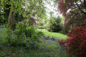
At the other end is the Royal Horticultural Society, proclaiming increasingly the importance of gardens and greenscapes to mental well-being. A recent article in the members magazine of the RHS looked at the work of Rupert King, a psychotherapist, who has planted and remade his garden to give a serene and calming outlook from his consulting room, and says that it is hugely helpful in treating troubled and stressed patients. He may find soon that these include property developers, driven to distraction by planners adding “beauty” to their list of planning conditions.
If you enjoyed this article please share it using the buttons above
Please click here if you would like a weekly email on publication of the Shaw Sheet

