
23 December 2021
Lies, Damned Lies and Coronavirus
Omicron – what’s the situation?
by David Chilvers

Omicron continues to develop quickly and according to medics has now become the dominant COVID-19 variant in the UK. Questions still need to be answered regarding its severity of disease but the number of “cases” relating to the new variant continue to go up fast. So how is all this being measured and are there any issues with the data. Just last week, the Health Secretary announced there were 200,000 “cases” of Omicron on a day when the published total on the coronavirus website was around 80,000 across all variants. So, what’s going on?
The definition of the number of confirmed Omicron cases comes from those positive tests which have been genome sequenced and identified Omicron as the variant. You may have seen the data published in this chart:
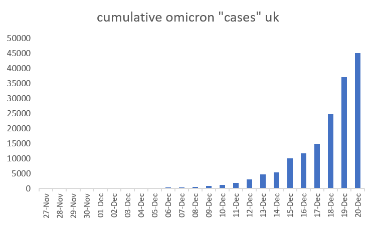
Clearly this chart shows a substantial rise but the total number of confirmed Omicron cases is currently under 50,000. And as this chart shows cumulative confirmed Omicron cases, it is bound to go up every day. If you look at the newly confirmed Omicron cases each day, the rise looks less dramatic.
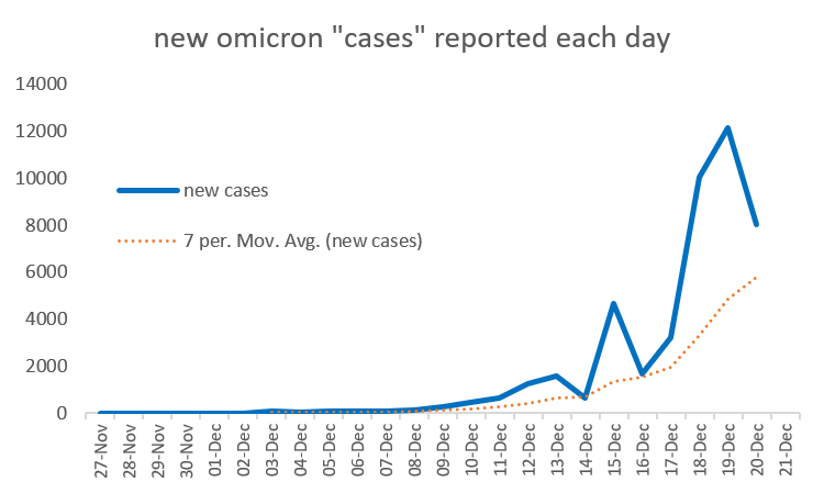
There are more erratic movements in this chart as the number of confirmed Omicron cases reported each day will depend to an extent upon the workload in the labs undertaking the genome sequencing – the numbers do appear to drop sometimes at weekends. The seven-day moving average irons out some of these erratic movements and shows a steady but not startling upward trend.
Only around 1 in 3 positive PCR tests is genome sequenced, so applying this factor the cumulative number of omicron cases among positive PCR tests would be about 150,000 in total. Finally, if only half of infections are detected, the cumulative number of Omicron cases would double again to around 300,000 in total, still a long way from 200,000 a day.
The key to the difference lies in time delays. If I have a test today, the results will be known tomorrow. If the result is positive then the specimen may be sent off for genome sequencing and this can take several days. So, it might be five or six days between the date of my test and the date of reporting. This means the estimated 10,000 or so Omicron cases reported on each of the past three days relates to the situation five to six days previously. With a doubling time of 2-3 days, the figure today might be four times the 10,000 reported and so about 40,000. David Spiegelhalter, a statistician at the University of Cambridge, has attacked the use of the 200,000 per day figure. “It’s bit naughty to give this number without having a justification behind it,” Prof Spiegelhalter said. “It’s not based on the published modelling that came out from UK Health Security Agency a few days ago. If you put that through their model it comes to 45,000 infections – which is high, but does seem more plausible” and would represent around half of the infections happening today.
But where do we go from here? If we assume we are at 50,000 total Omicron infections now and the doubling rate is every 2-3 days we will infect the entire population of the UK early in 2022. But that assumes the doubling continues indefinitely, an assumption made famous (or rather infamous) by the Vallance chart of October 2020 (courtesy of the Spectator COVID dashboard):
The reported number of cases were subsequently well below that forecast in the so-called Doomsday press conference and only rose above 30,000 once the Alpha variant took hold about this time last year. We have been here before, missing the point that initially infections rise by a larger number each day, they gradually stabilise and then start to fall as the number reaches the total pool of individuals open to infection. This type of curve is called a Gompertz curve and is used frequently to assess the growth of an infection. We covered it in a previous article relating to these forecasts. Assumptions need to be made including:
- How many people have natural immunity to the virus?
- How many people acquire immunity by experiencing the disease?
- How many people can be protected against catching the disease through various interventions including vaccination?
The forecasts made in October 2020 assumed there was no natural or acquired immunity and so were much too high. If we think about the situation now, clearly there is immunity for all three of the above criteria. Optimistically, we could argue that anyone with antibodies to SARS-COV-2 might have protection against infection, including Omicron. According to the latest weekly infection tracker, just over 95% of adults in England have such antibodies; the booster programme might increase this further. Let’s assume then that the available pool for infection is only 5% of the adult population in England – that’s about 2.5 million people. So, when we get to 1.25 million cumulative Omicron cases, the halfway point to 2.5 million, the growth rate would stabilise and start to slow down. On current figures that halfway point would be about 30th December.
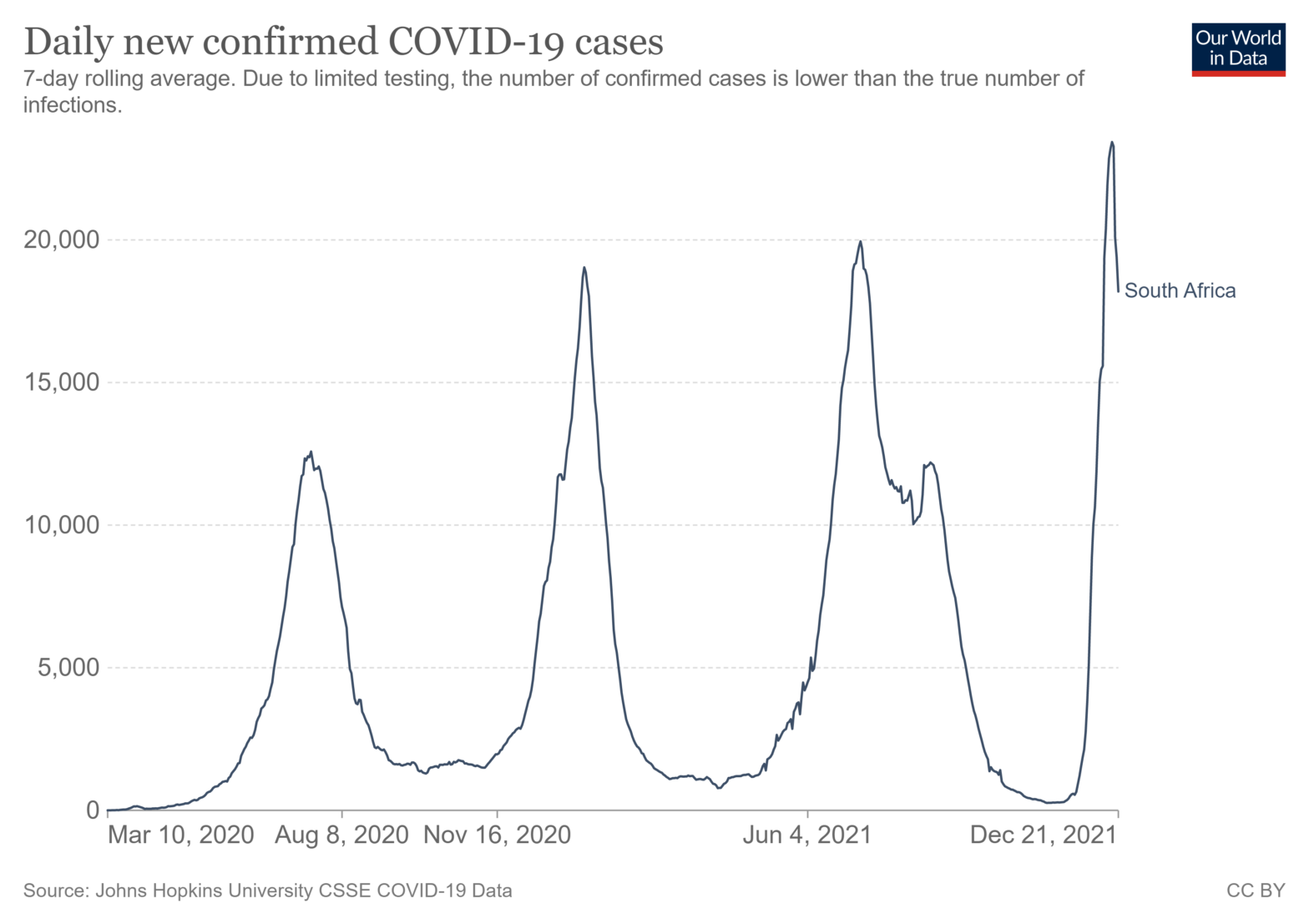
Of course, this is a very optimistic scenario but you could argue it’s no less likely than continuation of the doubling every 2-3 days and the whole UK population infected with Omicron as an early New Year present. Much has been made and, by and large ignored, of the comparison with South Africa, with a younger population but at the same time much lower rates of vaccination. The doubling time there has already dropped from two days to nine days. As a result, COVID-19 infections in South Africa are now starting to slow down as you can see from this chart from the “our World in Data” database.
Has the peak been reached this quickly? This would be consistent with a high level of natural and acquired immunity and a fast transmitting variant – “cases” quickly rise and then quickly fall as the variant runs out of people to infect. A recent paper, not yet peer reviewed, suggests this might be the case. Will this downward trend continue and will this also happen in the UK?
These are the “case” numbers reported since the rise to above 60,000 “cases” last week:
date new “cases”
22-Dec 106,122
21-Dec 90,629
20-Dec 91,743
19-Dec 82,886
18-Dec 90,418
17-Dec 93,045
16-Dec 88,376
15-Dec 78,610
14-Dec 59,610
On 15th December, “cases” reported rose from just under 60k to nearly 80k. In the six days from 16th to 21st December, “cases” were around 90k. If Omicron is now the dominant variant and Omicron “cases” double every 2-3 days, would we not expect to have seen numbers increasing sharply every day? Admittedly the “cases” reported today are the largest so far but this doesn’t look like doubling every few days to me. We don’t know but will soon find out!
Wishing all regular readers and Happy Christmas and I hope to stop writing these articles in 2022 assuming the pandemic is on its last legs; if not, I will continue to try and make sense of all the data and expose the most blatant misinterpretations of information.
This article is one of a series, the previous article on unintended consequences is here.