

8 July 2021
Lies, Damned Lies and Coronavirus
The kids are alright?
by David Chilvers
 This week, Boris Johnson outlined the plans to end the lockdown which started back in January. In spite of cases rising rapidly in the last few weeks due to the Delta variant, the view is that the vaccination programme has severely weakened the link between infection and serious disease, to the extent that the UK can live with fairly high numbers of cases without being concerned about any major impact on the NHS.
It is interesting to compare where we are now with where we were during the last wave, which started at the end of last year. On 29th June, the latest date for which full data is available, the seven-day moving average to that date was 20,469, using the date the test was undertaken as the reference point. The last time 20,000 positive tests was recorded in a seven-day period in the previous wave was for the seven days ended 2nd February. The table below shows how other metrics compared between these two dates:
| date | 29-Jun | 02-Feb |
| tests | 970,165 | 618,538 |
| positive tests | 20,469 | 20,815 |
| admissions | 279 | 2,677 |
| in hospital | 1,585 | 33,514 |
| deaths | 17 | 1,122 |
So, although the number of positive tests was the same on these two dates, the number of hospital admissions was about 10% of that in February, the number in hospital was about 5% of the level in February and the number of deaths was about 1.5% of the level in February. You could argue that this comparison is not fair as in June the number of positive tests is going up whereas in February it was coming down. So, if we look for the date when the number of positive tests in the previous seven-day period was above 20,000 and going up, we come to 12th December last year, where the data was as follows:
| date | 29-Jun | 12-Dec |
| tests | 970,165 | 312,536 |
| positive tests | 20,469 | 20,482 |
| admissions | 279 | 1,700 |
| in hospital | 1,585 | 16,529 |
| deaths | 17 | 433 |
Using this date, when cases were 20,000 in the last seven-day period and increasing, the number of hospital admissions was one sixth the level in December, the number in hospital 10% of the level in December and number of deaths 4%. Whichever date is used, and the December one is a fairer comparison, the translation of positive tests into hospital admissions, patients in hospital and deaths has been severely weakened.
The reason for this is the vaccination programme and the result that those currently becoming infected are much younger than was previously the case. The latest case rates shown on the Government coronavirus website for England are 301.5 per 100k for those aged 0-59 and 40.9 for those aged 60+. Delving a bit deeper using this data, the rate per 100,000 in England by age and sex is as follows:
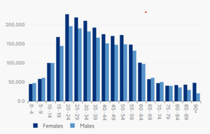
This chart confirms:
- Increasing positivity up to the 20-24 age group
- Gradual decline to a low among the 70-74 age group
- A slight increase from age 75 onwards for females but not males, but the base numbers here are much smaller than in other age groups
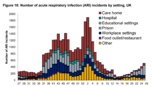
The media have covered stories of entire schools, year groups or classes being closed due to outbreaks. The analysis in PHE’s weekly Flu and COVID Surveillance report confirms the rising numbers of outbreaks in educational settings (week 25 is week ending 27th June).
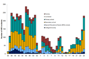
Breaking down this data for type of educational establishment shows that both primary and secondary schools are responsible, with a small number for universities (although this rose steeply in week 25, the week ending 27th June):
Whilst the rise of positive tests and the subsequent effect on schools has been covered in the media, that for universities has not. In scanning the map provided on the Government coronavirus site, I was intrigued to see how many high positivity areas were around university campuses. Regular readers will know we spotted this in October last year, when the return to school and university saw case rates rise dramatically in Medium Level Super Output Areas with “University” in their name. Repeating this analysis shows a similar effect occurring now:
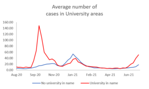
The sudden rise in cases per MSOA in areas with “University” in their name is apparent in mid-September/early October last year. After that period, cases in these areas returned to the same sort of level as those in other areas. However, from the start of June, the cases per MSOA in these “University” areas has again started to accelerate away from other areas. And this is just areas with “University” in their name; the comparator line will also include other university areas where rates are rising; for example, if you look at the centres of Oxford and Cambridge, you can see that the city centres, where all the colleges are located has a very high positivity level.


So, children in schools and students at university are becoming infected at increasing rates. Has the Government decided to just let this happen, allowing herd immunity to increase due to infection among the young (where there is low risk) and vaccination among the rest (to reduce the risk)? The end of school and university terms will likely see this effect level off in early August, when the Government is expecting the peak of positive case numbers to occur. What happens in September, when students of all ages return to their educational establishments with no social distancing nor other restrictions remains to be seen; but by then the level of immunity may be so high due to vaccination and/or having experienced the disease that there is no increase in infections as there was last autumn. We shall see.
This article is one of a series, the previous article on summer holidays is here.