
10 February 2022
Lies, Damned Lies and Coronavirus
Data issues
by David Chilvers

This column was originally set up to point out flaws in COVID-19 statistics and when the data improved our focus changed to pulling out key insights. The improvement in the quantity and quality of data has improved markedly since March 2020 and analysis has helped identify, amongst other things:
- The differential impact that COVID-19 has had on different ethnic groups
- The impact of age and existing health problems on the severity of disease
- The effect of the vaccine rollout
- The impact of students returning to school and university
- The limited impact of lockdowns on the spread of disease
Many of these insights ran against the prevailing wisdom. For example, the analysis on lockdowns concluded that the number of positive tests began falling before interventions started. The conclusion was that publishing data on rapidly rising infection rates altered consumer behaviour and it was this that led to reducing social contact and a reversal of the infection graphs rather than legal restrictions on people’s movements. This conclusion was almost heretic at the time but has now been more widely accepted and was one of the reasons that the Government refused to follow SAGE advice and have another national lockdown at the end of last year.
A meta study from John Hopkins University, not yet peer reviewed and going under most of the media radar, has come to the same conclusion. Where the media have commented on this paper, the feedback has been quite negative but this may well be because the conclusions are quite inconvenient for media that has consistently backed Government policy on restrictions.
But this is not really my point which is rather that the free availability of good data has allowed many outside Government to conduct their own analysis and challenge conventional views. The Spectator has done this as has the Shaw Sheet and respectable commercial organisations have now developed models to challenge the doomsters in SAGE. This can only be done with readily accessible and good quality data. Having taken two years to get to this point, there is some evidence that data may now start to dip in quality and become less accessible in the future.
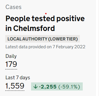
Regarding short term issues with data, on 31st January, ONS revised the way the number of positive tests was reported to an episode-based definition which includes possible reinfections. The change allows first time infections and reinfections to be reported separately. At national level, there is some fairly minor distortion in the time series but at a more local level figures by reporting date for 31 January for regions and local authorities within England should not be used as they include all reinfections added up to and including that day being added to a single day. Caution should also be used when looking at the 7-day totals and change figures presented on the postcode search page for the next 14 days.
This means that for two weeks, during a fairly important stage in the pandemic, the local figures are fairly worthless. For the first week, up to 6th February, all local areas saw a jump in the number of positive tests compared to the previous week as all reinfections up to 31st January were added as a single figure on that date. For the next week, from 7th February, all local areas will see a large fall in the number of positive tests as compared to the previous week.
This is the data shown on the website for Monday 7th February, the first day which will show large falls.

So, for two weeks the data on trends in the number of positive tests reported (“cases”) at a local level is fairly meaningless. The data for the number of positive tests (“cases”) by specimen date does not suffer from this distortion, as all reinfections have been coded back to the specimen date; but this is clearly not possible for the data on number of positive tests (“cases”) reported as by definition once data is reported it’s reported. To add to the confusion, the data on reported cases is shown on the daily summary for an area (without the data on cases by specimen date) whereas the detailed data when you drill down into cases for that area shows the data on cases by specimen date and not by date reported. If anything was designed to obfuscate and confuse, this ticks all the boxes. It is disappointing that two years into the pandemic, when the quality of information has generally improved substantially, this change will render trends meaningless at a local level for a couple of weeks.
In another development reported in several of the mainstream press, a Government source said that the Prime Minister himself has pencilled in Easter as the latest date by which the daily Covid statistics will be published in their current form’. ‘In an ideal situation, he (Mr Johnson) will bring an end to them sooner if the current downward trend in deaths continues,’ the insider added. ‘Ending the daily Covid death toll is part of the Prime Minister’s strategy of living with Covid. It is hoped taking the focus away from the Covid figures will also help people move on with their lives.’ The UK Health Security Agency (UKHSA) and Department of Health and Social Care both declined to comment.
There is clearly a debate to be had about the interval for publishing data to move away from the standard daily reporting on the news bulletins which doesn’t really give much insight. However, ceasing to publish anything will certainly take the focus away from COVID as with no data there will be no stories.
A similar trick is being perpetrated with statistics on illegal immigration. The Home Office historically issued the data after arrivals had been processed by the UK Border Force, typically on the following day. However, the UK Statistics Authority is understood to have raised concerns about the current way migrant numbers are released.
A Home Office source said it is ‘currently considering advice’ from the authority ‘to ensure the underlying trends and total number of small boat arrivals can be presented clearly’. The department is now set to release the figures every three months, but the move has drawn criticism from Tory MPs – with one saying it ‘seems more like burying bad news than being transparent about crossings’.
Alp Mehmet, chairman of Migration Watch UK, described the decision as ‘absolute nonsense and undemocratic. It is utter nonsense. People are not going to stand back and wait for the figures to be issued. It is all going to come out anyway. It is presumably because they don’t like the flack when large numbers come in’.
Have you seen any media comment on small boats crossing the English Channel recently? This is probably not due to the problem going away but due to data not being available; without data it is hard to write a story.
This is classic 1984. In Wikipedia, it is noted that one of the most notable themes in George Orwell’s’ book is censorship, especially in the Ministry of Truth, where photographs and public archives are manipulated to rid them of “unpersons” (people who have been erased from history by the Party). On the telescreens, almost all figures of production are grossly exaggerated or simply fabricated to indicate an ever-growing economy, even during times when the reality is the opposite.
Suppressing data is an essential first step towards assuming the problems do not exist anymore and removing evidence- based reporting. Stopping the publication of data means that no-one outside of Government knows what is going on, whether this relates to COVID or illegal immigration. As a result, there are less media stories and the Government can focus on other activities. Whether there would be backlash when figures are eventually reported would depend upon what the figures show, but it would be too late by then to do anything about it. But it’s a slippery slope to be going down.
This article is one of a series, the previous article on peak or pique is here.