

6 May 2021
Lies, Damned Lies and Coronavirus
A third wave?
by David Chilvers
 On 8th April, the SAGE modelling subgroup SPI-M published a paper which outlined a number of scenarios for the way COVID-19 might develop as the planned relaxation of restrictions takes place. In its summary, one of the papers’ conclusions is that “It is highly likely that there will be a further resurgence in hospitalisations and deaths after the later steps of the Roadmap. The scale, shape, and timing of any resurgence remain highly uncertain; in most scenarios modelled, any peak is smaller than the wave seen in January 2021, however, scenarios with little transmission reduction after Step 4 or with pessimistic but plausible vaccine efficacy assumptions can result in resurgences in hospitalisations of a similar scale to January 2021”.
Within the paper were charts for cases, hospitalisations and deaths using models from Imperial College and Warwick University, reproduced below. The commentary just prior to these charts is that “As with previous SPI-M-O modelling of easing restrictions, all scenarios from the three groups lead to a distinct third wave; there is significant uncertainty in both the timing and scale of its peak with results differing between the groups and across the sensitivity analyses. For the central scenarios modelled (with significant transmission reduction after Step 4, very high uptake and no waning immunity or escape variant), the peaks are estimated to be lower than those seen in January 2021 and likely below those seen in Spring 2020 (Figure 4). The resurgence is a result of some people (mostly children) being ineligible for vaccination; others choosing not to receive the vaccine; and others being vaccinated but not perfectly protected (including those who have only received one dose, rather than two). This means population immunity – which is the reason the waves modelled here start to shrink – is not achieved from vaccination without further infections.”
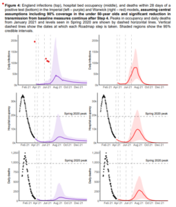
Both these models “predict” a peak in cases, hospitalisations and deaths in August 2021. Although some scientists have disagreed with this scenario, SAGE members continue to talk about a summer wave. Professor of epidemiology John Edmunds, who is a member of SAGE has said cases are “inevitable” with half of the population unvaccinated and the UK is at “significant risk of a third wave this summer as restrictions begin to ease.”
Given the previous track record of these models in predicting particularly deaths (the now notorious 4,000 deaths per day shown at the Downing Street press conference in late October), how realistic are these “predictions”.
To understand this, it’s worth looking at how the lockdown at the start of 2021 compared to the first lockdown which started on 23rd March last year. The key dates are as follows:
| activity | date 2020 | date 2021 | Gap (days) |
| lockdown started | 23-Mar | 01-Jan | 81 |
| meet with up to 1 outdoors | 16-May | 08-Mar | 69 |
| meet with up to 6 outdoors | 02-Jun | 12-Apr | 51 |
| non-essential shops | 16-Jun | 12-Apr | 65 |
| pubs, restaurants, hairdressers | 04-Jul | 12-Apr/17-May | 65 |
| gyms, swimming pools | 25-Jul | 12-Apr | 104 |
| casinos, soft play, beauty salons | 08-Aug | 12-Apr/21-Jun | 82 |
The relaxation of specific restrictions varies between the two lockdowns, but typically in 2021 we are about 60 days ahead of what happened in 2020 (if you take the average of the first four relaxations above it is 62.5 days). So, if we showed the trends for both years, but with the 2020 data lagged by 60 days, it would show how the patterns vary.
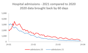
This chart shows the trends in hospital admissions. I was fascinated at how similar the shapes of the curves are when the lag is incorporated and all the way through, the level of hospital admissions for 2021 is below the relevant figure for 2020.
There is a similar pattern for the number of patients in hospital.
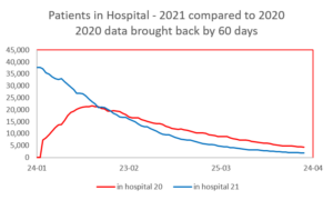
The low numbers at the start of the curve for 2020, which relate to when the pandemic started in March (shown under January with the lag), almost certainly reflect that the availability of data was not universal in the first few weeks. Following this period, we see the same pattern as for hospital admissions, with the 2021 curve following the shape of the 2020 curve but significantly below it.
Finally, the chart below looks at the number of deaths:
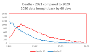
There is a similar comment here related to data from March last year (shown under January with the lag) and once again the two curves have similar shapes, with 2021 below 2020 all the time.
We cannot show this analysis for the number of positive tests, as testing in March/April 2020 was restricted to testing of those admitted to hospital and the resultant number of “cases” was severely understated.
These three charts show us that, if we allow for the 60-day lag:
- The reduction in hospital admissions, patients in hospital and deaths with COVID-19 follow a very similar pattern each year
- The absolute numbers in 2021 are significantly below what was seen in 2020
That the numbers are lower in 2021 seems entirely reasonable given the speed and success of the vaccination roll out, and it seems very likely that this factor is what is keeping the numbers below what was seen last year. The scale of the next set of relaxations due not before 17th May is not really opening up society more than last year, so we might expect the above trends to continue. The only real difference from 2020 is that all restrictions including social distancing are planned to be relaxed from 21st June, but apart from that social interaction this summer should be at similar levels to last year. And even if social distancing restrictions are removed, it is likely that a large percentage of the population will continue to do what they have been doing for over a year now and be careful about the number of people they interact with at close contact in indoor settings.
It is worth looking at where we might get to this year. As we noted recently, these are the lowest figures that we achieved in July/August last year.
| Low point summer 2020 | |
| Positive tests | 367 |
| Hospital admissions | 72 |
| ICU admissions | 8 |
| Deaths | 3 |
Using our 60-day lag, we might expect to get to no more than these levels by June this year, given that all the curves for 2021 are significantly below those for 2020. So, we might expect less than 300 positive tests each day, less than 50 hospital admissions, around 5 ICU admissions and perhaps 1-2 deaths. This would be before any removal of social distancing measures on or after 21st June, and so we would have some faith that these sorts of levels are likely to be reached in a couple of months’ time.
This doesn’t look like a third wave in the summer to me.
This article is one of a series, find last weeks on risk here.